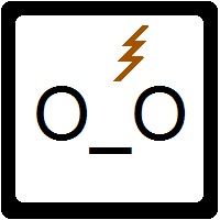
Well, I finally did it. This took so long to make, I can't even tell you. It's far from perfect but it's good enough. I'm not quite done everything I need to do to make my blog design complete but this was the major step.
I got the concept for the "Potterpuffs" from Naomi, who was the originator of the idea. Unfortunately, you can no longer see her original work on her site anymore.
To make the banner, I used Paintbrush (the Mac equivalent for MS Paint). I was way too lazy to figure out anything more complex that this.
To make the Potterpuffs, I used this tutorial and this tutorial.
Love it or hate it?
Thursday, January 20, 2011
Subscribe to:
Post Comments
(
Atom
)


I love your banner! It's so funny :D
ReplyDeleteI remember feeling awful after HP ended, like I couldn't "move on" :P
Wow !! I love your banner !! It's so funny and the drawings remind me of a cartoon I watched when I was younger ... =)
ReplyDeleteIt's terrific! Must be something in the air just now...I took a notion to re-do my blog design yesterday too. Spent all day on photoshop but finally made something I'm happy with.
ReplyDeleteFor now. :D
I love your banner! It's so cute! Harry Potter forever!
ReplyDeleteI love it! It's so cool! Congratulations on your awesome new banner!
ReplyDeleteBrush Up On Your Reading
Awww. I love your banner. It's way too cute. I wish I was half as talented as you.
ReplyDeleteLove it! Great job of teaching yourself. I wish I could've figured it out.
ReplyDeleteI love your new banner, it's great! Very cute and funny.
ReplyDeleteAwwwwwwwwwh! Thats so cute! :DD So powerpuffie!
ReplyDeleteToo cute. You did a fantastic job. I love the new look.
ReplyDeleteIt looks great! I love it!! :0)
ReplyDeleteI love it Aylee :D I've been thinking about changing mine for a while, but I have no idea what to do with it.
ReplyDeleteI love this so much XD And it's so true!
Oh my gosh I love your banner!! Seriously, I just burst out laughing (and then had to try to explain why to a non-Potter fan). The facial expressions, the words, using the two HP fonts! My god, could you have made this any better? I don't think so. You are full of win, Aylee. Full of win.
ReplyDeleteVery cute!
ReplyDeleteGreat job Aylee! I love the little characters, they are too cute. And if someone told me one of my favorite stories was coming to an end, I would have the same reaction she's having:) Love that they're called Potterpuffs. Adorable.
ReplyDeleteAylee the banner is awesome! I love it! I've been hearing rumors that JK Rowling isn't done with Hogwarts yet. It gives me hope!
ReplyDeleteIT'S ADORABLE!!! Great job, Aylee :)
ReplyDeleteI love it! It's adorable. Good Job.
ReplyDeleteLOVE IT. Duh. Because it's awesome.
ReplyDeleteAbsolutely adorable! Love it! :)
ReplyDeleteLove it!
ReplyDeleteLove it! It's so dang adorable :D
ReplyDeleteLove it! hehe:)
ReplyDeleteWow! Congrats on the fantastic banner. It looks great. :)
ReplyDeleteThe cutest banner ever! Love it. I have a Mac, and now I'm dying to try Paint. Thanks for the links to the tutorials.
ReplyDeleteAw, cute new header! Just stopping by to let you know I've passed on the Stylish Blogger Award to you. You can see here for details.
ReplyDeleteAlso, by the way - did you get my e-mail? :)
"NEVER!" - LOL
ReplyDeleteYou did a great job on your banner! :)
I love it! I love PotterPuffs
ReplyDeleteLike it! Very fun.
ReplyDeleteIt's adorable! I love it!
ReplyDeleteI love it Aylee!! It's so cute!
ReplyDeleteDefinitely LOVE it!! Super cute!
ReplyDeleteLOVE IT!! But seriously, you could have given me some warning before you featured my distraught face in your banner. Yeesh :P That girl is totally me. Shut up Harry, before I poke you in the eye with your wand! *bursts into tears*
ReplyDeleteAwesome job on the banner :D
Love it! It's so cute!
ReplyDeleteI LOVE IT! I used to watch the Powerpuff Girls all the time. :D
ReplyDeleteAwesome! I love your banner so much! It does not look like it was your first time to create Potterpuffs~ you're very good, really. :')
ReplyDeleteThis is so adorable awesome job.
ReplyDelete